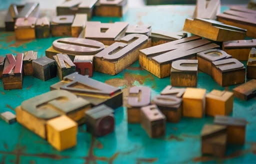
5 Common Typography Mistakes Every Designer Should Avoid
“It’s not a mistake to make a mistake,
but it’s a mistake to repeat the same mistake.”
– Author Unknown
The first mistake you should never make as a designer is thinking that you’re not responsible for the text in a layout. The art of arranging type is called typography, and it is central to every designer’s skills.
Simon Garfield, the author of “Just My Type,” a book that may be the definitive look at typography and the role it plays in our communications, points out, “Fonts can either enhance the message or get in its way.”
As a professional designer, your goal is to deliver the message successfully. And to do so, you must avoid these 5 common typography mistakes:
1. Missing typos.
Many designers, or at least the ones I’ve encountered over the years, tend to be bad spellers. We often think of words as graphic elements or concepts. Our visual talents make us wildly creative. People who are good spellers tell me that they think of words as linear, progressing toward some meaning or human understanding. It’s not much different from the way a mathematician views numbers and symbols sequentially to solve math problems. While designers can tell the difference between Helvetica and Arial in a heartbeat, non-designers can spot a typo a mile away. Typos – to a non-creative – look unprofessional and sloppy, and they will always overshadow a great design. Take the time to ask a friend to proofread, hire an editor, or invest in an app like Grammarly.
2. Using incorrect accents.
These tiniest of marks have extremely different meanings. By using the wrong one, you will not only create a grammatical error, but you’ll also show your lack of attention to detail. Take the time to learn and use them. This dash (-), for example, is a hyphen used to break two words apart, but this dash (–) represents the words “to” or “and.” Also, there is a huge difference between an apostrophe ( ’ ) and a foot ( ‘ ). One is a smart (curly) quote, and one is straight. If you aren’t sure which mark to use, you can take advantage of this handy guide for accented characters and dashes, and then learn how to type them on your Mac or PC.
3. Using web fonts for print.
You may not be aware that web fonts are specially modified fonts built to enhance readability on a screen in a variety of digital environments. They are not built as complete font sets and will be missing special characters or bold and italic variables. Another important reason is that you will be violating the user agreement and technically will be stealing. Stick with OpenType fonts. OpenType fonts are made for both Mac and PC systems and offer support for multiple languages and rich typography.
4. Using unlimited fonts.
The rule of thumb is to use no more than two fonts in a document. That may feel restrictive for your creative vision, but keep in mind that most fonts already come with a bold and italic version. So that means you actually have four fonts. And if you pick a font with extra variants, such as condensed or black, you have more than your fair share. Stay away from “costume” fonts like Papyrus, Comic Sans, and Hobo. If you are not sure if you are choosing wisely, simply avoid any fonts that don’t offer variants.
5. Not addressing rags, widows, orphans, and rivers.
While these sound like elements in a Victorian novel, these four concepts are important to understanding typography. Mastering them will help put the finishing touches on your typography.
- Rag refers to the uneven edge of a text block. In our text here we are using what is called “Left Flush” or “Rag Right.”
- A Widow is a lonely word which ends up as the last line of a paragraph.
- An Orphan is a single line that ends up by itself at the top of a column or a page.
- Rivers are created by gaps of white space running through a paragraph due to a coincidental alignment of word spaces.
You can fix all of the above by adjusting the kerning and type width to force line spacing. Take the time to address these in your final draft as edits and layout changes will affect the text flow.
Keep in mind, the work you touch affects more than just the aesthetics of the piece; it also affects your client’s reputation. And the way in which you address your client’s work affects your reputation and determines your level of professionalism.