Blue Star Roundup: Our 9 Favorite Brands and why They Work
Branding is difficult, and it can be hard to make your company’s voice heard in a sea of competition. That’s why the team at Blue Star Design’s come together to give you our favorite brands and why we think they work. Each one of the brands listed has a unique approach that speaks to target audiences and turns them into customers.
1. Headspace: Design With A Purpose
“Headspace is a meditation app. The app guides users through learning to meditate and focusing on various issues you may want to meditate on in order to relieve stress or learn more about yourself. It is by far the easiest introduction to meditation I’ve ever tried. I love their brand look: it is simple, playful, and effective, with a calming color palette that reflects what the app is all about. They apply their branding very consistently across all platforms, and I instantly know it is Headspace just from the look. I absolutely love Andy Puddicombe, the founder and the voice guiding the user through the meditation—he has a soothing tone and a lovely British accent. I can feel my muscles start to relax when I hear his voice. Headspace has a free introduction, and then a subscription for a pretty affordable fee.” –Sue Harris
2. Aldi: Reaching Wider Audiences
“Aldi is remarkable to me because they’ve built an entire business around being the “other,” and they excel at it. Aldi offers non-name-brand food at affordable prices. Far from other discount or wholesale stores, Aldi’s employees are cheerful and their food is exotic. I’m not sure Save-A-Lot would carry the goat cheeses and pestos I see at Aldi all the time. Their recent campaign to introduce organic food into their stores, opened them up to a whole new demographic and made old shoppers happy to return. Hopping on the health-food craze was probably the smartest move Aldi could have made, as more health-conscious and eco-friendly millennials buy apartments and go grocery shopping for themselves. Now, instead of being a cheap grocery store with imported chocolates, Aldi is THE inexpensive grocery store for every demographic.” –Mackenzie Barry
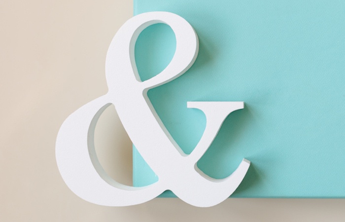
3. Tiffany & Co.: Iconic Color
“I only have one piece of Tiffany – a pair of eyeglasses, that I stopped wearing because, personally, I’m more of a miu miu gal. However, what amazes me about the Tiffany brand is that they’ve built such strong visual recognition simply based off of one color. That color that is known as Tiffany Blue – a light medium robin egg blue that Tiffany & Co. uses extensively on promotional materials, including boxes and bags. The color was first used on the cover of Tiffany’s Blue Book, first published in 1845, and they’ve since managed to have it trademarked. Before you go and try that yourself – understand that trademarking a color is nearly impossible. Only 9 other companies have managed to do such a thing.”– Julia Briggs
4. IKEA: Simplicity at its Best
“IKEA is a made up word created by combining the initials of the founder’s name (Ingvar Kamprad), the name of his family’s farm (Elmtaryd), and the small town in southern Sweden where he was born (Agunnaryd). The beauty of a made up brand name is that there are no meanings associated with it, so the story can be developed without the clutter of previous definitions or preconceived notions about existing words. As Kamprad’s ideas about business, furniture design, and concepts like self-assembly were forming in the early days of the company, the brand story began to develop: IKEA is modern, clean, functional, accessible design that is affordable. The IKEA logo, reflecting the simplicity of their furniture lines and home products, is made up of two primary colors, yellow and blue, with sans serif lettering. I’m not a designer and can’t tell you why, but the yellow emblem pops from the logo’s blue background, not offensively, but with the joy and optimism of the brand and company. It’s not unlike the joy and optimism customers feel when they open up an IKEA box and bring its furniture to life in a new space (minus the slight frustration, of course, from guys like me who don’t like to follow the directions).”–John Briggs
5. Anthropologie: Consistent Aesthetic
“The brand I’ve chosen is Anthropologie, best known for women’s clothing and accessories. They have a vintage/bohemian/whimsical aesthetic that I love. It’s been interesting to watch this brand evolve and grow over the years. They have expanded to include home decor and accessories as well as bridal and eveningwear. They’ve found a way to reach a wider age range of women than they did even 10 years ago. The brand look and feel is really consistent and strong whether you’re scrolling through an email, flipping through a catalog, or visiting a store. They deliver a consistent experience and the products are well-curated in a way that consistently reinforces the brand while remaining on trend. They rely much more on visuals than words to tell their story, which I find interesting.”–Meghan Sullivan
6. Apple: Creative Advertising
“My favorite brand is Apple. From the iconic “1984” ad that was played during the Super Bowl and the 1997 “Think Different” campaign, to the more recent “iPhone 7 and iPhone 7 Plus in 107 seconds” video from 2016, I have always been impressed with the way Apple chooses to reflect its brand to the end user. One of my other favorite Apple campaigns was for the iPod with the color backgrounds and silhouettes of dancing iPod listeners. Apple has never been afraid of clean, simple design and they aren’t afraig to ”–April Clark
7. Amazon: Exceptional Service
“Amazon is a company I return to again and again because of product availability, reliability and service. Invariably, when I’m looking for a specific item online, Amazon has it and offers the best price. Shipping is timely and tracking makes it possible to know when the order will arrive. In my experience, their customer service has been exceptional as well.”–Martha Boesel
8. LEGO: More than Just a Name
“Few people know that the word LEGO comes from the Danish phrase “leg godt” meaning, “play well.” Even the company’s Danish founder, Ole Kirk Christiansen, didn’t realize until long after the name was established that the word in Latin also means, “I study” or “I put together.” With its name rooted in playing and connecting and building and learning, the brand consistently delivers on its promise to create simple toys with an infinite number of possibilities. The visual identity has evolved with changes to the product line, but it has always been bright and playful, with the current logo containing elements dating back to their 1948 design. This brings continuity to their story and connects generations.”–John Briggs
9. The Complete Peanuts: Cohesive Design
“A collection of every Charles M. Schulz Peanuts strip (fifty years of art collected in 25 books) published by Fantagraphics Books and designed by the cartoonist Seth. All 25 book covers feature one of the iconic Peanuts characters and are colored with a limited range of grays, blacks and a single background color. The color scheme and the consistent use of type tie the whole series together beautifully. More importantly, the design takes the familiar drawings of some of the most recognized characters of all time and presents them in an entirely new, dramatic way and does so in a manner that only compliments and enhances the original art. The publishers could have produced this series using only the original artwork as it was seen in the original strips, staying true to the Peanuts “brand” but instead created an amazing new work that will no doubt help introduce Shulz’s work to future generations.”–Pat Lally
All the brands listed here are memorable not because they’re famous or they’re sales-y. They are memorable because their brand resonated with their audience. Whether it was an iconic color or sleek design, these brands did a top-notch job of connecting with consumers.
If your company is considering rebranding, talk with Blue Star Design about how we can help. For examples of companies who we’ve worked with on branding, check out our work with Red Tree House.