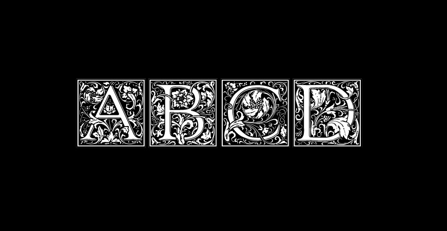
Adventurous Type: The Decorative Drop Cap

As the self-described type nerd in the office, I am always looking for interesting typography examples in my personal reading and for best practices for graphic designers in the digital world. Drop caps are those letters that are larger than the body text—usually dropping down into a space in the body text for several lines. They can be dramatic or plain, using the same font or sometimes a fancy font.
I have always loved the illuminated manuscripts that we studied in art history class—the drop caps are often these glowing little jewels in a sea of hand-drawn letters. They are tiny works of art that served to help the reader mark important ideas or a new section of text in a manuscript. The Book of Kells and the Book of Hours are both exquisite examples of the hand drawn initial cap in historical documents.
As a Book Arts student, I gained hands-on experience with metal type fonts and the lovely initial cap fonts that printers developed to mimic the initial caps of illuminated manuscripts. The individual letters can be deceptively simple or lavish engravings that are almost sculptural. As someone who loves to experience the world with all the senses, the touch and feel of the metal type and the impression and ink on paper enhances my enjoyment of a special book or printed piece. How can you not want to touch the indentations of letterpress or the raised surface of engraved inks?
Drop caps became a purely decorative element as modern typography and editorial styles developed over time—using subheads, indents and spacing breaks that help guide a reader through an article or book. The software that designers use these days makes it easy to add a drop cap to text; however, fine-tuning the kerning and spacing around the drop caps is highly recommended.
As a magazine designer, I often used drop caps to introduce sections of an article or in the introductory paragraph as a graphic element to create a visual break in a page of text. Photographs and illustrations can be combined with the letter to make them more interesting. Sometimes a screened back or lighter version of the first letter of a paragraph can be used behind the text to create visual interest. For inspiration, I look to the blog Daily Drop Cap or I scan Etsy to find lovely examples that are treated as art prints.
Drop caps can be fun or funky, lavish or luminous, serious, or stunning – so experiment a little. Be adventurous!