How to USE Design-driven Blogging to Supercharge Your Blog

You wrote a blog that is 1,000 words – perfect length – great job! You were careful to use keywords in your headline, first paragraph, and URL. Very nice! Your page title is spot-on at 65 characters. You have links to previous content. You threw in some easy-to-digest bullet points. And you finished it all up with a powerful call-to-action. Yay! Your job is done.
Hold it! Nope. Not quite. You still have some work to do.
By definition, you did your job by writing an amazing blog article with powerful SEO – the kind Google loves. But what about the Millennials and Gen-Z viewers you are hoping to attract? What happens to them once they land in all that text? The answer: they drop off quickly.
If lengthy blogs with rich key words are the magnet bringing young viewers to your site, how do you keep them there and make them lap up your important information? With Design-Driven Blogging, of course.
We are living in the age of visual information where visual content plays a role in every part of life. Gen-Z and Millennial age groups increasingly respond more to edgy and visual marketing. That means 65% of our population is relying on visuals to consume new ideas. And this isn’t because “Millennials hate to read.” It’s really because the human brain loves visuals. It’s gobbles them up like candy. And with today’s technology and resources we can provide imagery faster than ever before.
Here are 5 reasons why the human brain “hearts” pictures, according to Sh!ft Disruptive Learning.
- Visuals stick in long-term memory. One of the easiest ways to ensure that customers store your information in their long-term memory is to pair messaging with meaningful images. Research has found that this tactic increases recall better – so if you want people to remember you, use visuals.
- Information is consumed faster when it is visual. Visuals are processed 60,000x faster in the brain than text. In fact, as you read this, your brain is interpreting each letter here as an image. Do you realize how incredibly inefficient that is for the brain? If you want viewers to comprehend your message quickly, use visuals.
- Information is consumed better when it’s visual. Our vision is a power-hungry sense that outdoes all other senses when it comes to taking in information. Our brains like to quickly scan everything it can to get the gist what it needs to know, rather than taking the time to swim through a barrage of letters and numbers. More interesting is that the brain really pays attention when it sees things that move. So if you want to stop your viewer in their tracks – use moving visuals.
- Visuals trigger emotions. Visual memory and emotions are processed in the same area of the brain. And for most people, emotion is the catalyst to buy. That’s why marketers and designers often focus on trying to create emotion through visuals.
- Visuals motivate people to learn. Seeing a picture allows our brain to anchor a concept to the picture. When we recall the image, we also quickly recall the message. This is why professional educators use visuals in their teachings – and why you should use visuals too.
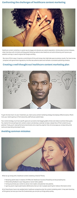
Here is an example of what design-driven blogging looks like:
The Benefits of Design-Driven Blogging Design-Driven Blogging allows marketers to keep readers in blogs longer by using lots of imagery throughout the blog. The imagery helps to visually communicate or support the story. Think more like a magazine article and less like a textbook page. The use of appealing visuals can sell people on what you are saying – just like how great packaging can influence buying behavior.
A study published in the journal Psychology & Marketing used an fMRI machine to measure brain activity of participants whiled they viewed different types of packaging. The study discovered that viewing attractive packaging caused more intense brain activity than neutral packaging. Appealing packaging caused activity in areas of the brain associated with rewards, while unattractive packaging caused activity in areas of the brain connected with negative emotions.
Design-Driven Blogging breaks the content up into “snackable” portions by placing multiple pictures throughout the content. It helps the reader to digest each section of the story at an appropriate learning pace. And one of the best benefits we’ve discovered is that it allows our social media team to repost the same content over and over, each time paired with one of the multiple image choices. The result is that the content allows looks fresh. Design-Driven Blogging may add a little more to time to your already time-consuming blogging efforts, but it will be well worth it when your readers engage and your message sticks in their brains like candy. Yum!
