Crop Where it Counts
The one change request I always seem to get from clients is to “stop chopping the tops off people’s heads.” Now that sounds pretty gruesome and violent. But I am not a savage (a pirate maybe, but definitely not a savage). And I’m really not doing any chopping — I am simply cropping.
As designers, we are taught a technique called the Rule of Thirds when we’re cropping. So technically, I am following the rules like a law-abiding citizen just doing a bit of slicing and dicing to help you appear more human, likable, and friendly in your photos.
And look, unless you have personally just broken the law yourself and the photo is mugshot, you must try and obey rules, too … and let me chop your top.
What is the Rule of Thirds?
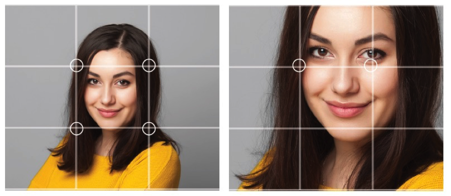
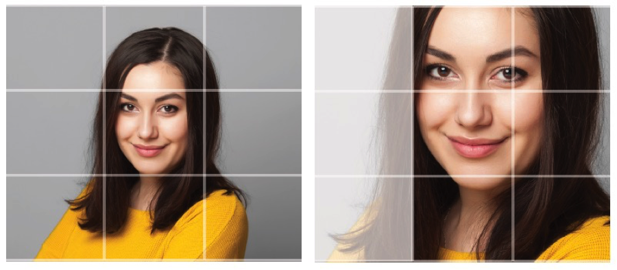
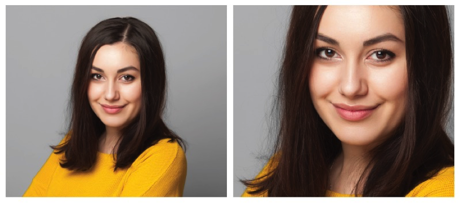
The Rule of Thirds was first introduced by John Thomas Smith in 1797 in a composition entitled “Remarks on Rural Scenery.” It involves sectioning your composition into vertical and horizontal thirds. The important elements in a scene are then to be placed along the section lines or at the points where the sections meet, but never dead center. In a headshot, the eyes are always the most important element.
Why follow the rules?
- You’re more recognizable.
I’ll let the experts at Science Daily explain this: “Our brain extracts information for facial recognition primarily from the eyes, and secondly from the mouth and nose.”
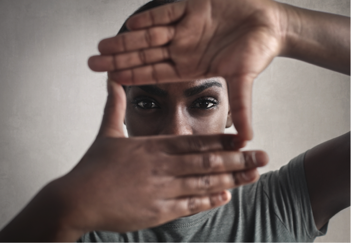
Imagine a looking at a photo of a friend, Science Daily advises. You might think your brain needs every last detail to recognize the friend, but studies show it actually needs only a small slice of facial data — a selection around 30×30 pixels, to be precise. In other words, nobody’s brain cares about the top of your head or your hairdo.
So when cropping a photo, it’s important to keep the eyes higher up in the grid — along the top two intersections, preferably. Doing so makes the photo appear to be at eye level and creates the feeling of eye contact. The more you focus in on the eyes, the more
- You will appear more engaging and better balanced.
Who wouldn’t want to be engaging and balanced? But did you know that the way to look balanced is to actually be a bit off-center? It looks more natural to be anywhere but right smack in the middle of the picture frame. So try to position the face in two of the vertical intersections, preferably.
- You become larger than life.
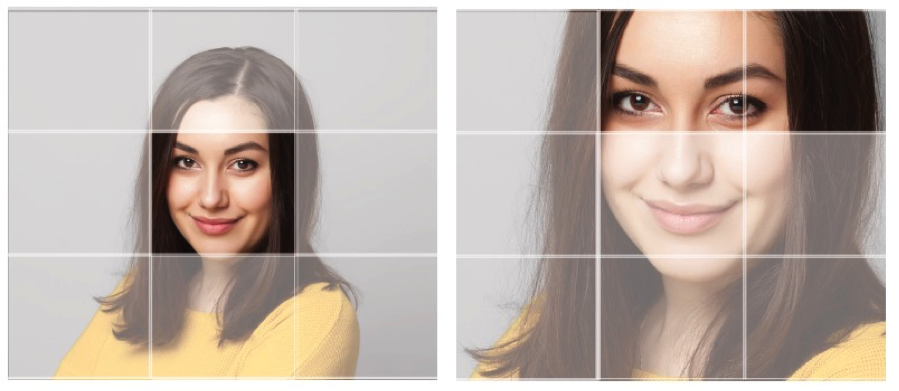
All that white space surrounding your head says nothing about you. It’s a waste of real estate. A closer crop creates a bigger sense of emotion and drama, revealing much more about your personality.
Don’t overdo it, though, and give yourself such a big head that you hog the whole frame. Leave a bit of breathing room (also known as “look space”) and you’ll look much more relaxed and pleasing to the eye.
See, nothing to be afraid of — just a nip here and a tuck there. And no one gets injured in the process.
Want to know more?
You are more than just a pretty picture. Visual storytelling is more prominent than ever (thanks to social media and mobile browsing), and it’s forcing brands to up their game. Design is everywhere, and user experience influences us all in our everyday lives — helping us navigate a website or simply fall in love with a brand.
At Blue Star, our goal is to create designs that evolve and connect with an intended audience — whether that piece is your business card or your trade show booth. It’s important that each one of your projects, big or small, deserves the respect of great design.